
The Brief
El Alsson is an international school in Cairo, founded in 1982: three parallel curricula, forty-five nationalities, a fourteen-acre campus. Forty-four years of stories, programs and achievements, and a website trying to hold all of it at once.
The brief, in one sentence: modernize the website and keep everything. Every page stood for an audience the school could not afford to lose, so the site spoke quietly to everyone and clearly to no one.
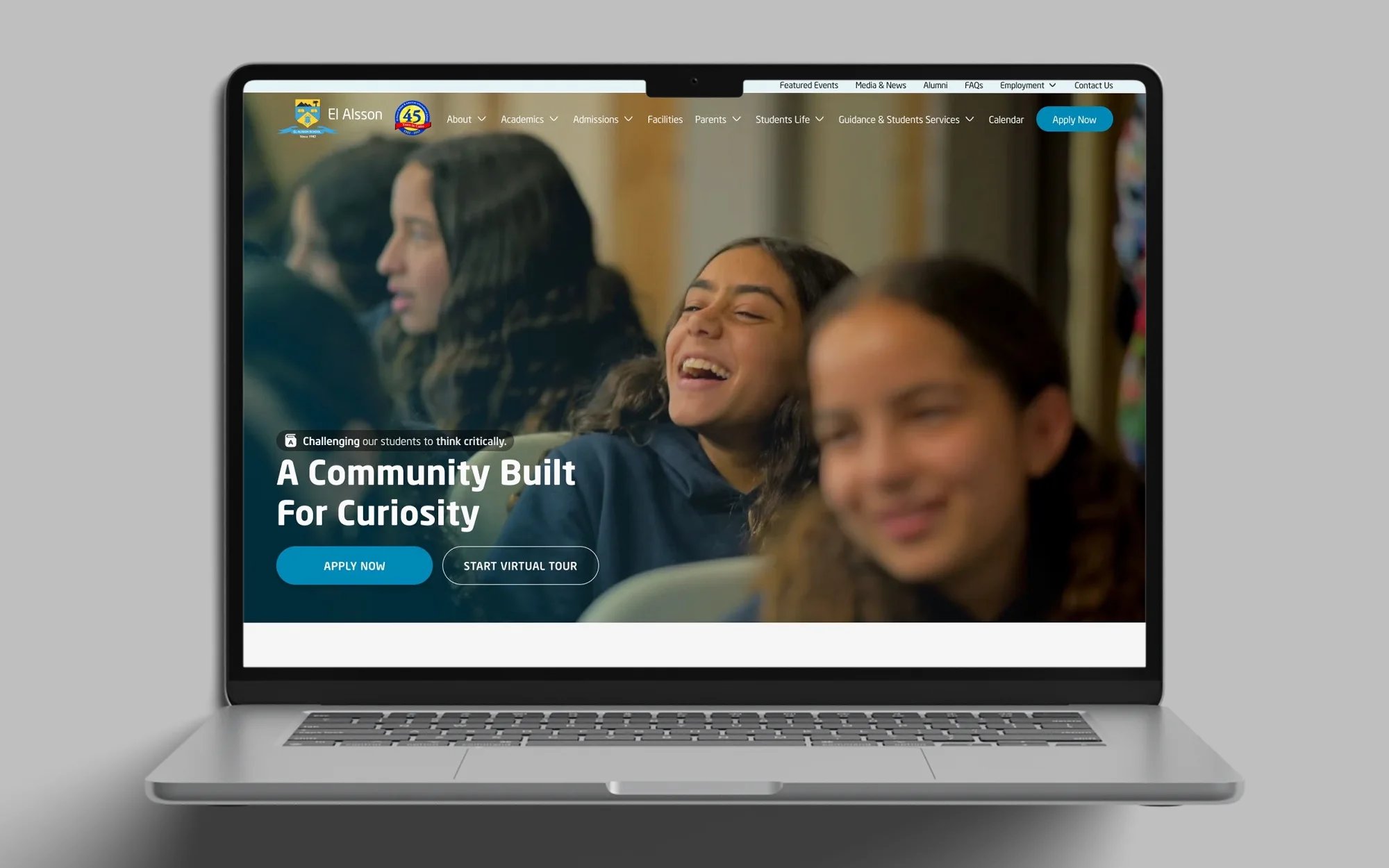
My hypothesis: the homepage’s job is to hand every parent the one thing they came for, in the fewest possible clicks. One page, three intents, a triage counter rather than a brochure cover.
The Challenge
Fourteen top-level navigation items, five of them dropdowns, and fifty-eight internal pages, most of them unquestioned for years. I audited the site the way a parent meets it.
- Information architecture: every section landed on an “Introduction” page first. The site wasn’t just deep, it was gated.
- Hierarchy: prospective parents, the alumni association and the accreditation office got the same billing.
- Density: “How to Apply”, the most decision-critical page, needed long scrolling to see the whole picture.
- Mobile: responsive in the technical sense, not the design sense.
Before the first meeting I built the map I wanted to argue for: just the site’s shape. The client’s instinct was the opposite, to keep every page and add more. The meeting ran four hours. Some of my proposals held; on others the client was right. I kept the consolidation and the end of the Introduction pages. Together we found something neither of us started with: teaser sections for Alsson El Kheir and the Parents App on the homepage.
Key Decisions
The sitemap is the story people notice. The smaller decisions underneath make the site work. Every design-system rule became a line in HANDOFF.md, eight hundred lines by the end, each with a “why”.
- The 12px text floor: no DOM text smaller than 12px, after captions had drifted to 9 and 11px.
- Icons are 16, 20 or 24 pixels, never larger. A 32px PDF icon was crowding the file-card titles.
- One spacing scale, and one ScrollReveal on every meaningful block: opacity 0 to 1, 28px up, 700ms.
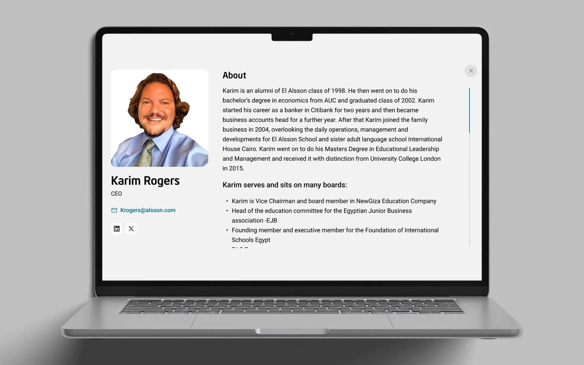
Who’s Who became a pop-up. Forty staff at equal emphasis became a filterable grid inside About, with a bio pop-up for depth on demand.
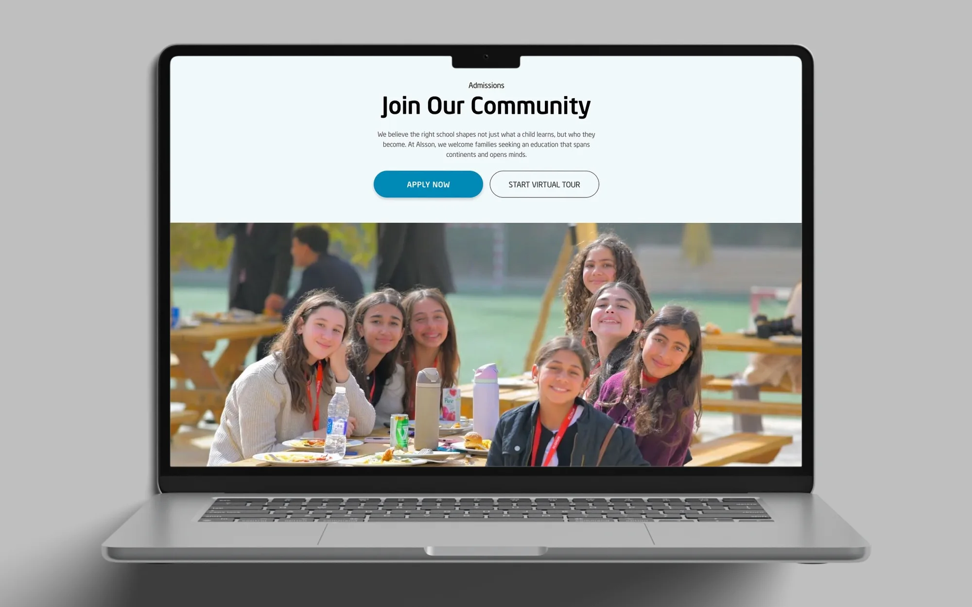
The sub-nav I resisted. The client insisted, and on a 3000-pixel Admissions page a sticky in-page nav appears on scroll. I was wrong to push back.
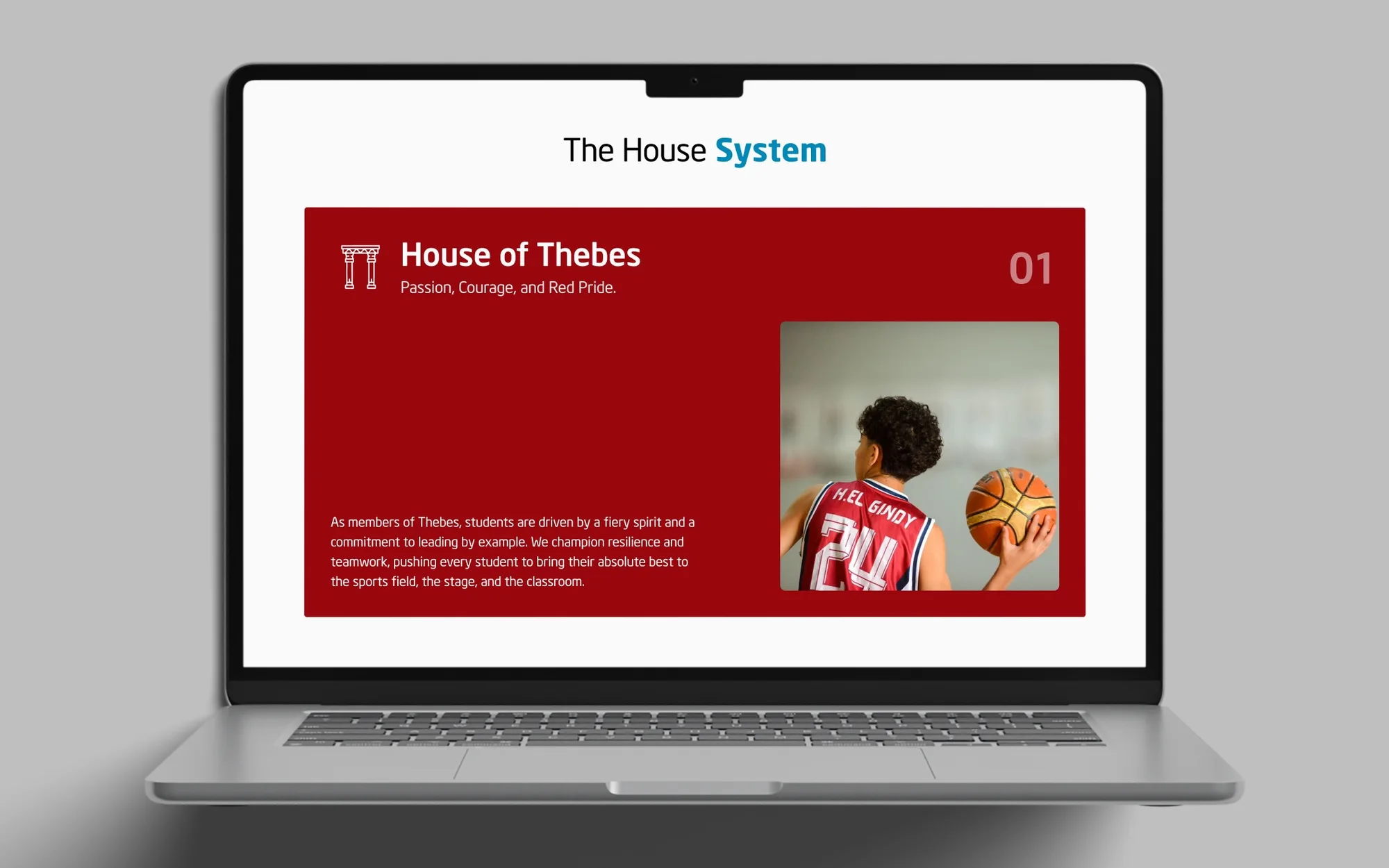
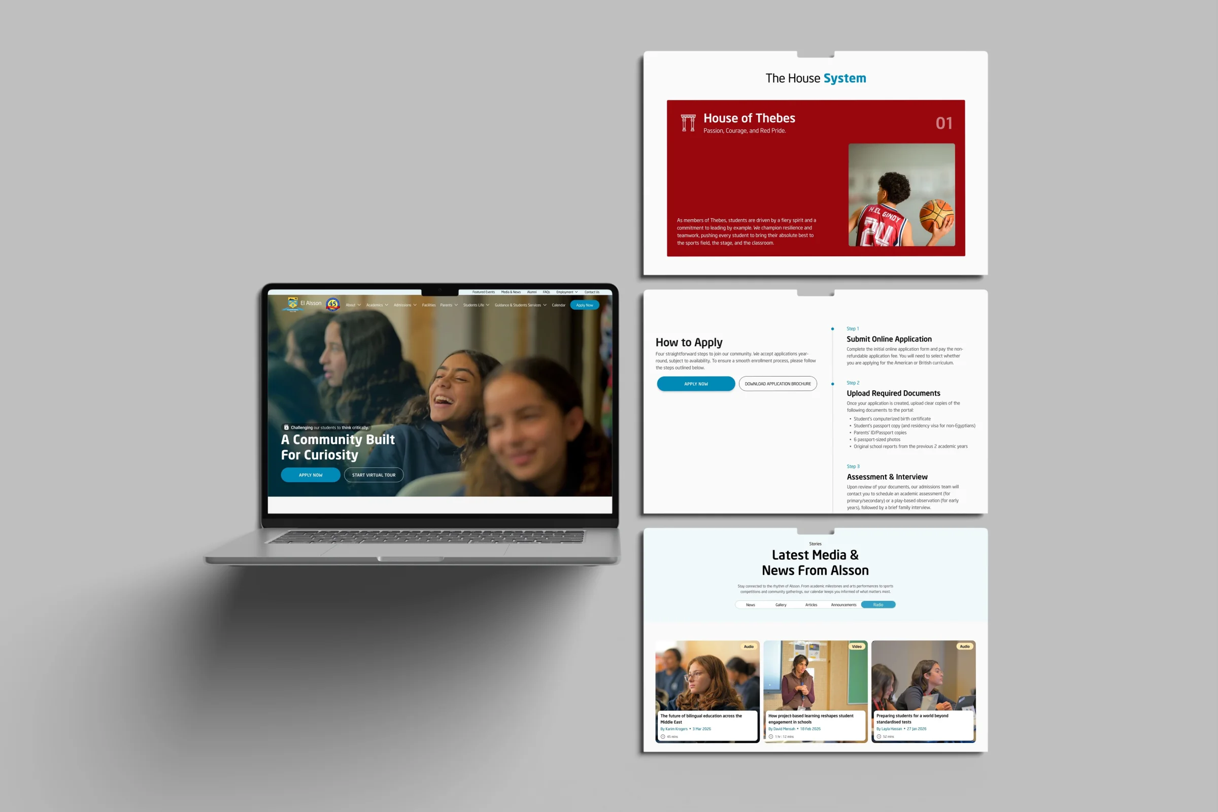
The House System as a horizontal reveal. Each house appears beside the previous one as you scroll, until all four sit in a row: reveal, then unity.
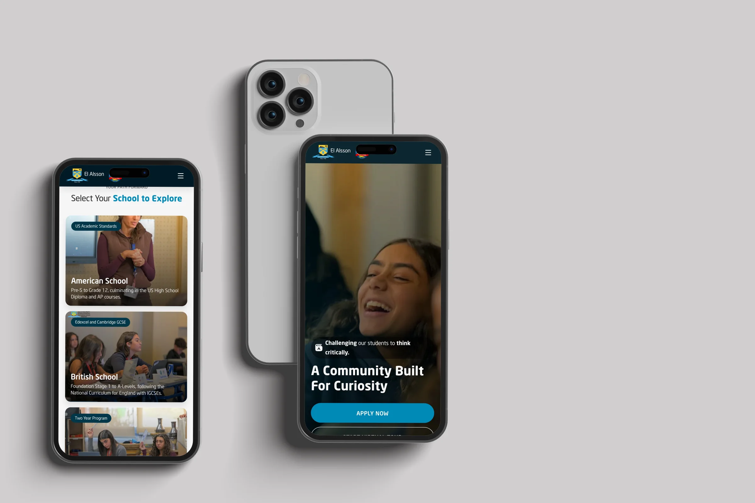
Skip the mobile Figma pass. “Still need Mobile ver.” Four words in a sketchbook corner changed the second half of the project. I proposed building the mobile version in code, vibe-coded with Claude, and treating the codebase as the design deliverable. Every visual decision stayed mine, made on a running site. The design head’s answer was one word: “Try.” The CEO saw the working prototype and added a bonus to the invoice.
The Screens
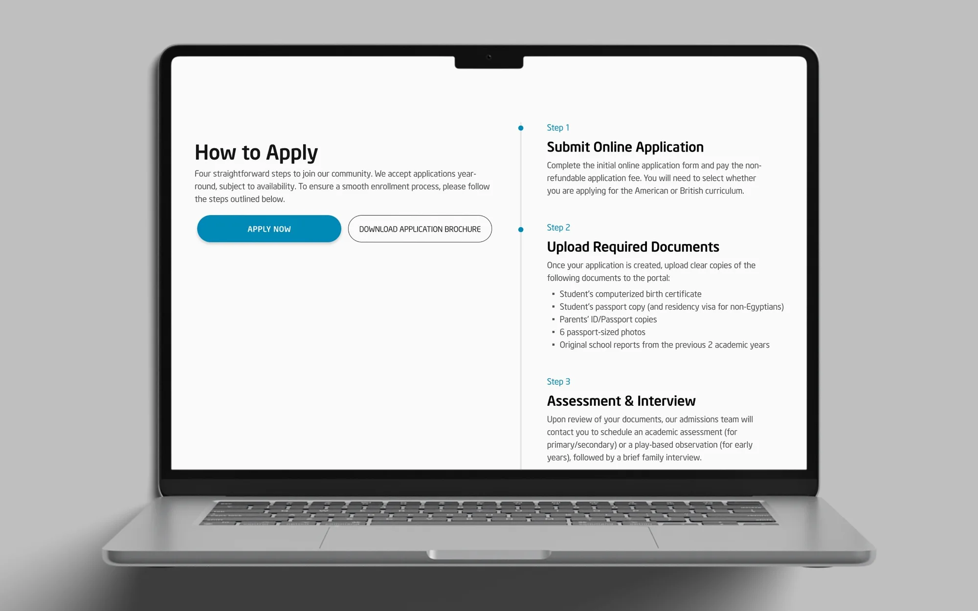
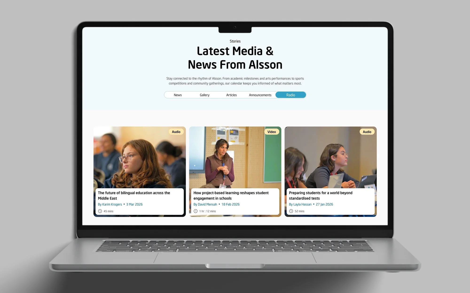
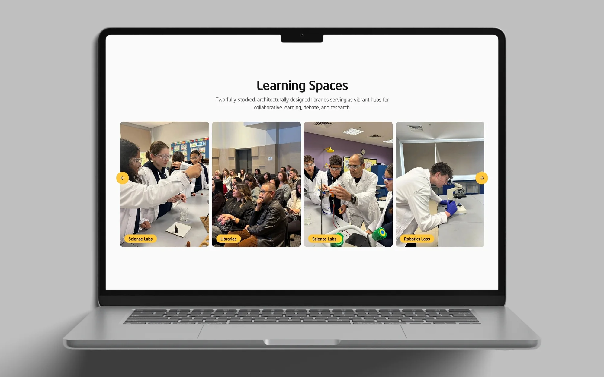
Outcome
Designed and built, launching soon. The design system ships with the codebase as an 800-line HANDOFF.md.
- 58 → 23 internal pages after consolidation, while the client wanted more added.
- 14 → 9 top-level nav items, with every Introduction page gone.
- 5 days from concept to a polished, animated thirteen-page mobile build.
Four hours in a room forces you to know what you’re defending. I know how to argue for architecture now, and how to write a design system by watching my own decisions. Claude can turn a mobile Figma pass into a five-day prototype, but it can’t sit in that meeting.
The mobile-scope decision should have been made before the desktop pass ended. And the sticky sub-nav I resisted belonged in my original proposal: on any page that scrolls past two viewports, it is the right pattern.
Supervised by Mitch at MitchDesigns; the rest of the team built the backend.