Case study / Fitness education

Fitness Pioneers

A redesigned Arabic learning platform for fitness trainers, with course discovery and a lesson screen that is easy to follow.

Role
UI design
Through
Direct client
Duration
1 month
Industry
Fitness education

The Brief

Fitness Pioneers (رواد اللياقة) sells courses that teach people how to become fitness trainers. The platform is a learning management system, and I’m redesigning its UI, a one-month project. The redesign covers the public pages, the course pages, the cart and checkout, and the student dashboard. The screens are in Arabic and laid out right to left.

The Challenge

A course platform has to sell and teach. Public pages must explain a course and make someone want to buy it. Once they are a student, the same product has to feel calm and clear while they learn. The challenge was to hold both in one visual system.

Key Decisions

Course discovery works like a scan. The course list shows each course as a card with a photo, a level tag, a rating, its hours, the start date and the price. Category chips sit above the grid, and a filter panel on the side narrows the list by level, type, price and length.
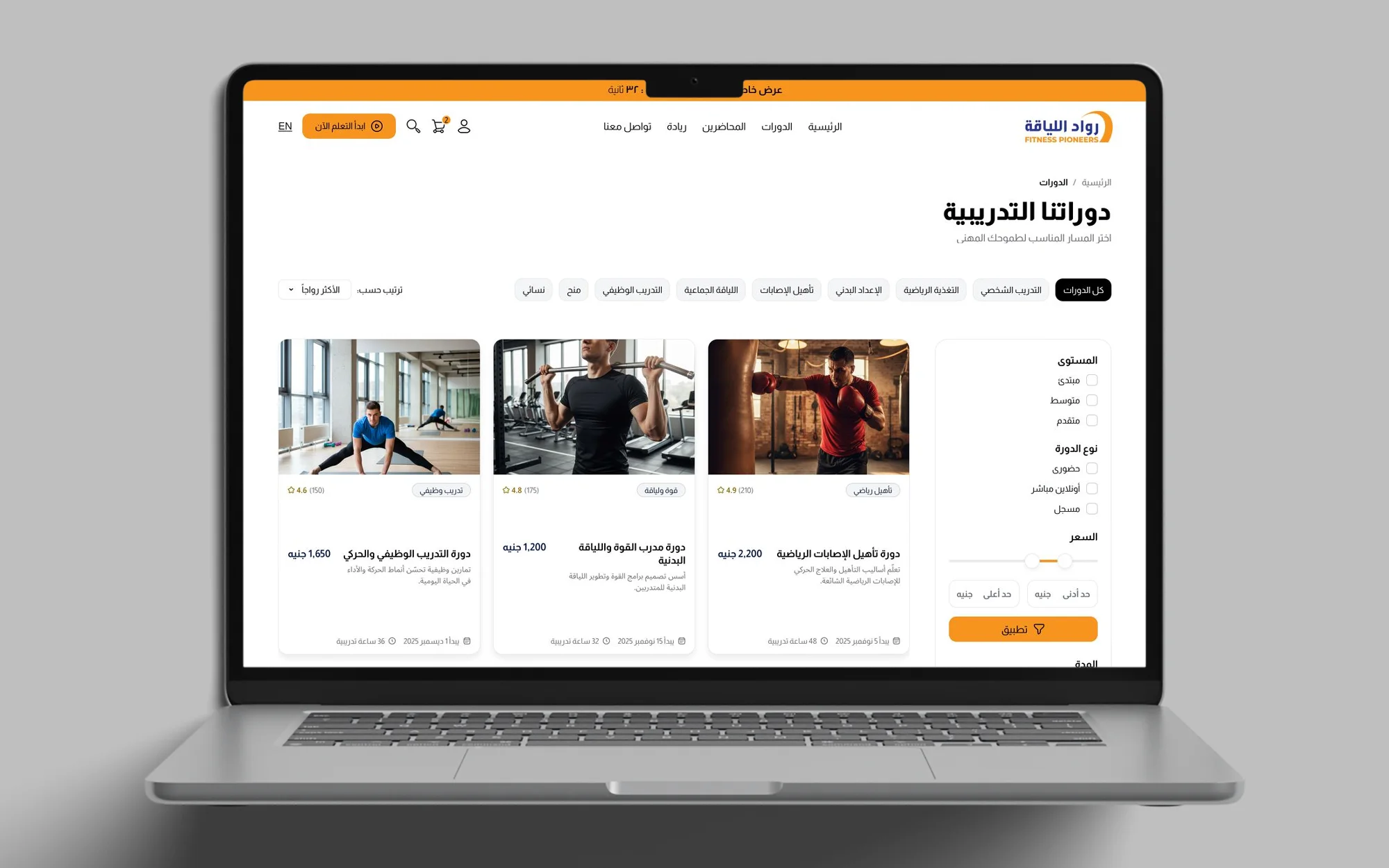
The training courses list: category chips across the top, a filter panel on the right and a grid of course cards with prices
The course list: category chips, filters and a card for each course.
Search with suggestions and popular courses.

The course page explains before it asks for money. The title, the description and the level come first, then the video, the accreditation options and a purchase card with add to cart and enrol. Below, the curriculum opens into modules, and locked lessons show a lock.
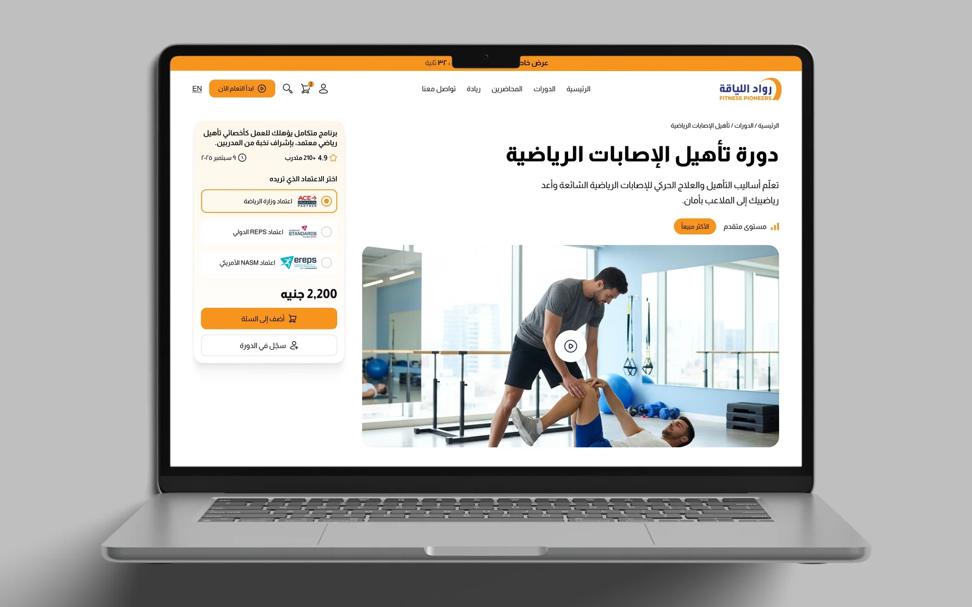
The sports injury rehabilitation course page: title, description, a video poster and a purchase card with accreditation options
The course page: title, video and the purchase card.
Add to cart opens the cart drawer.

The learning screen keeps the course within reach. The outline sits beside the player, with each module’s lessons, a check mark on the finished ones and a progress bar with a percentage. Under the video come the lesson title, the description, the downloadable files and the final test.
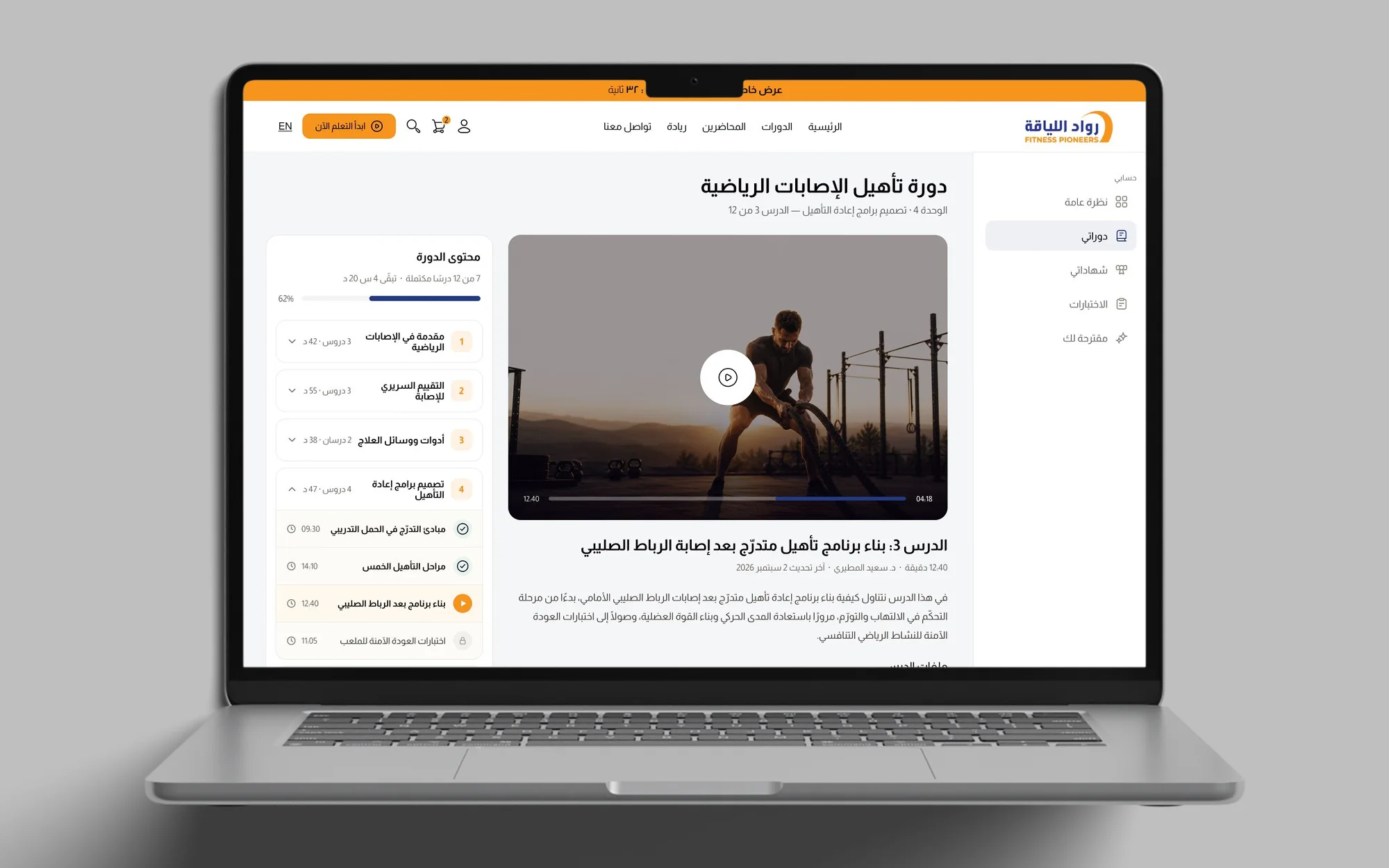
The lesson screen: the course outline on the left, a video player, lesson files to download and a final test card
The lesson screen: course outline, player, lesson files and the test.
Starting the test opens the first question.

The Screens

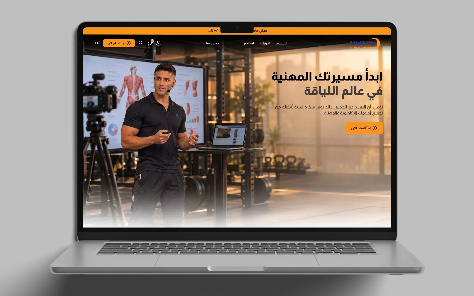
The Fitness Pioneers home page hero: a trainer presenting, the headline and the main call to action
The home page hero, with its main call to action.
The cart icon opens the cart drawer.
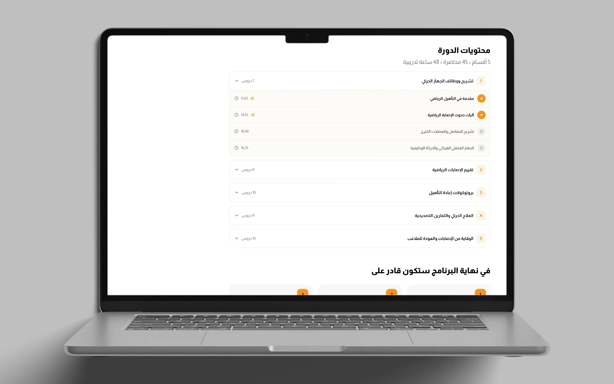
The curriculum list: numbered modules, the first one open with lessons, and locked lessons marked with a lock icon
The curriculum: modules open into lessons, and locked lessons show a lock.
A course card opens its course page.
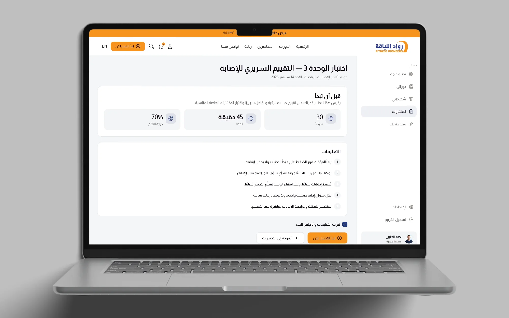
The unit test start page: the number of questions, the time allowed, the pass mark and the instructions
The test start page: questions, time and pass mark.
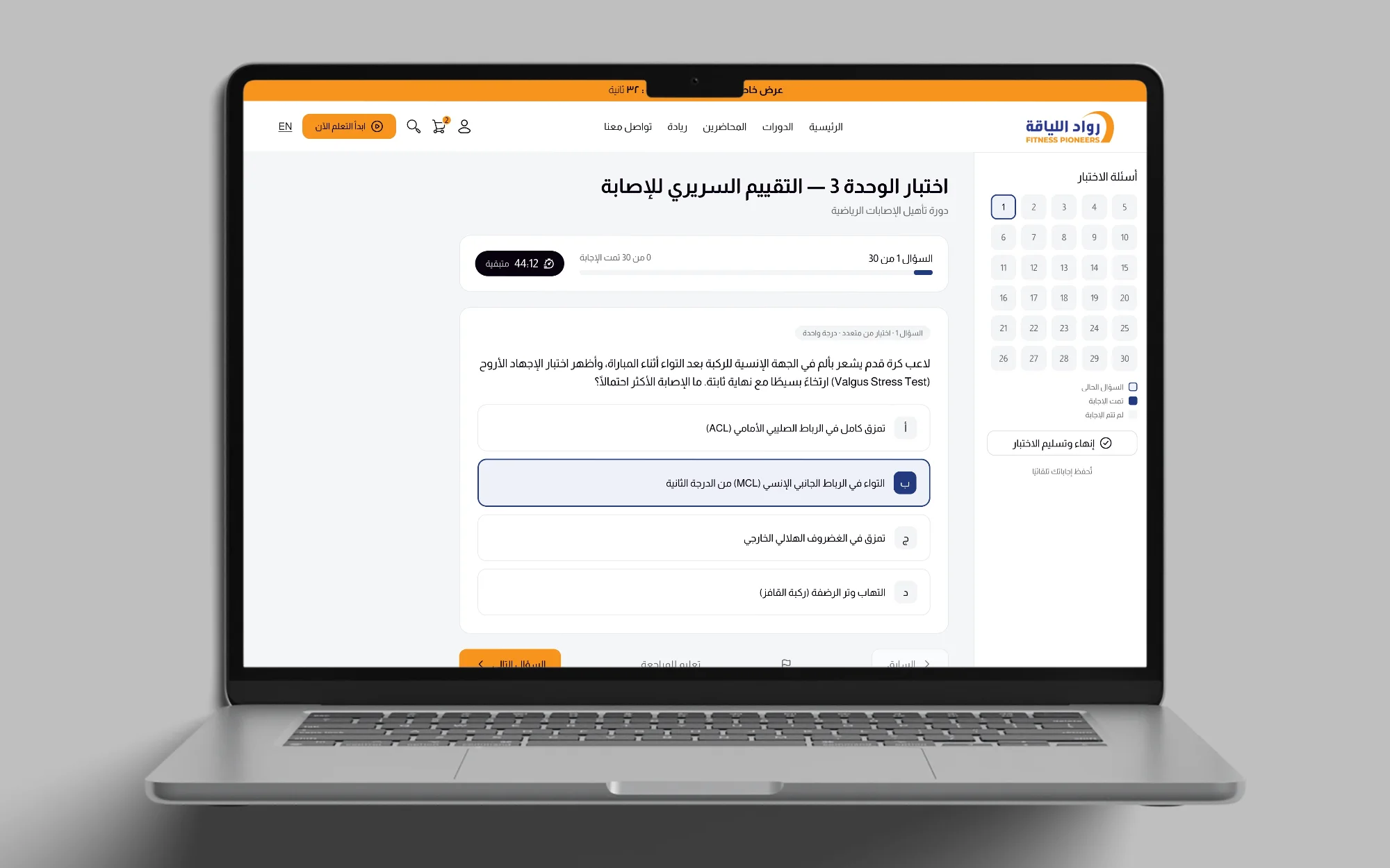
A unit test question with its answer choices and the question map beside it
A test question, with the question map beside it.

Status

In development. The redesign is one month of UI work, and it is not live yet.
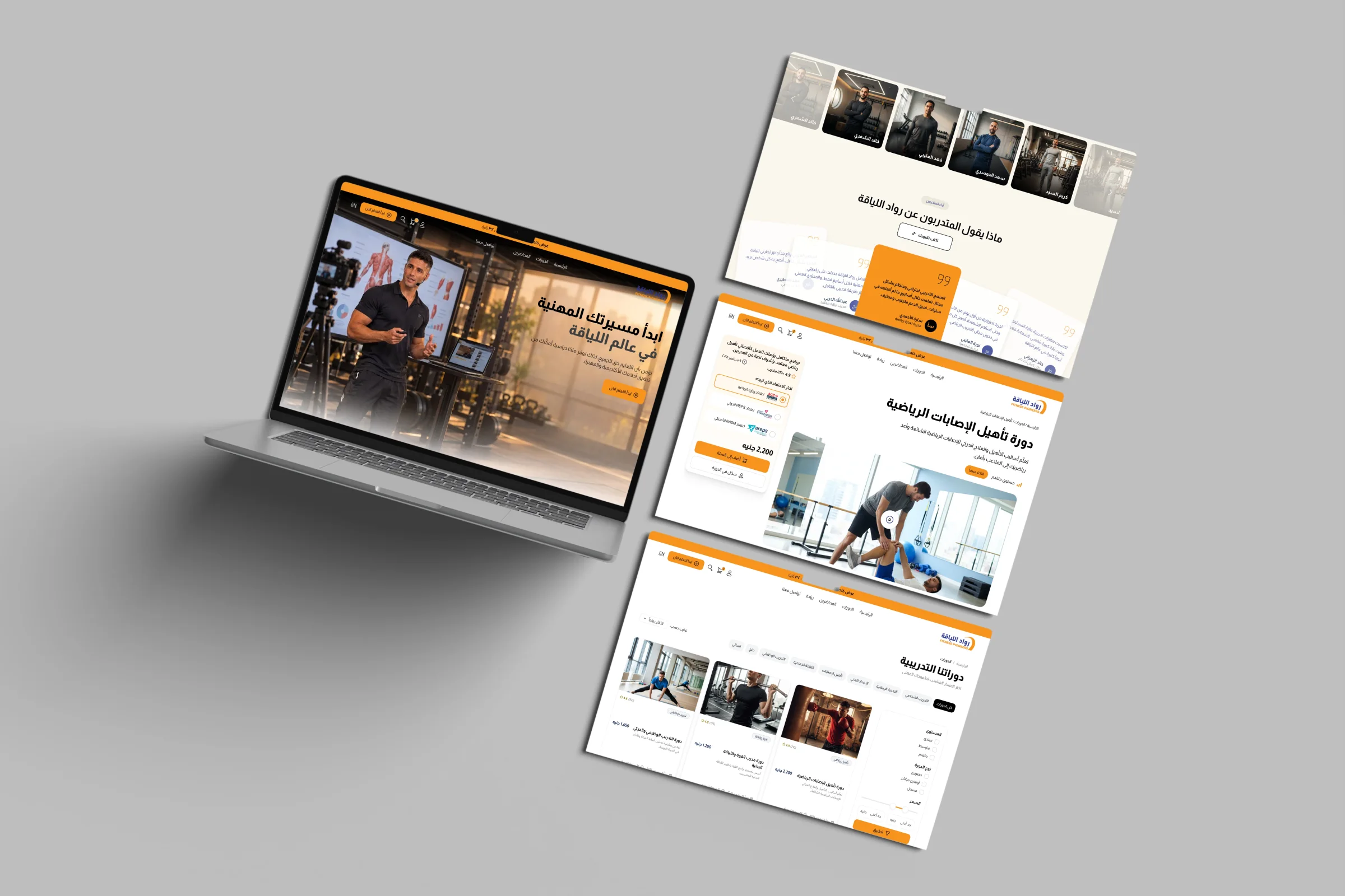
Fitness Pioneers screens on a laptop and screens
Home, the courses, a course and its reviews.
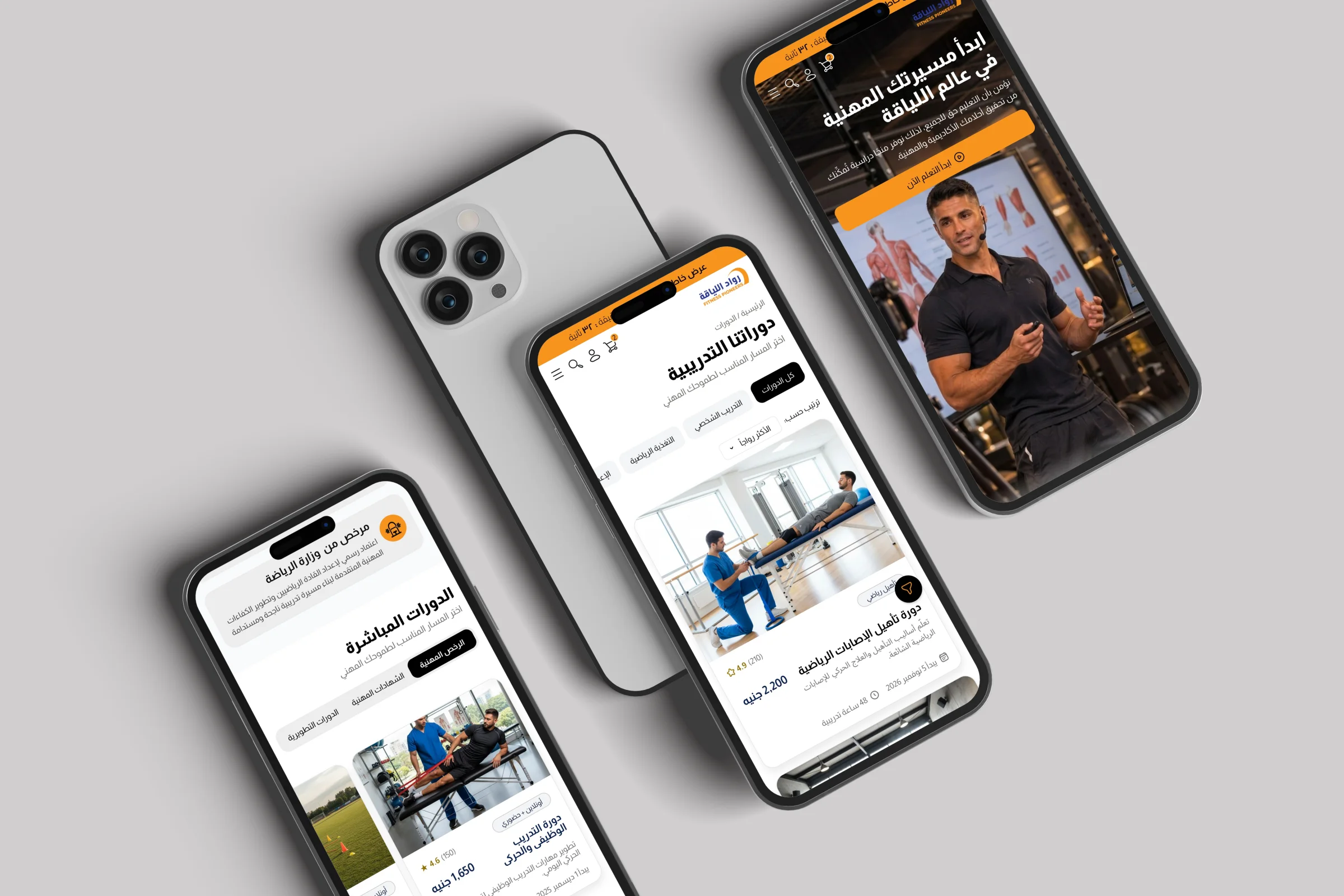
Fitness Pioneers mobile screens on phones
The platform on phones.

Client feedback

The client liked the UI and how easy the whole learning platform is to use.