
The Brief
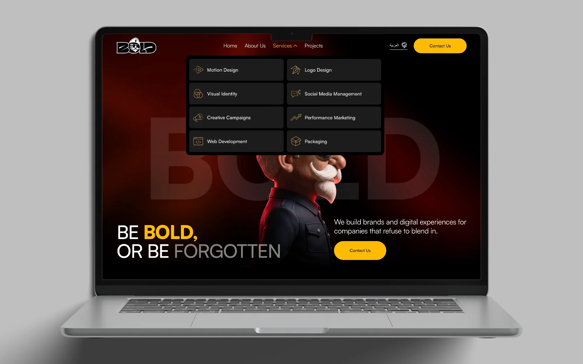
Bold is a marketing agency that builds brands and digital experiences. The site had to do three jobs: say who Bold is, show the eight services it sells, and prove the work with real projects. A visitor should be able to reach the team from anywhere on the page.
I designed the UI in two weeks.
The Challenge
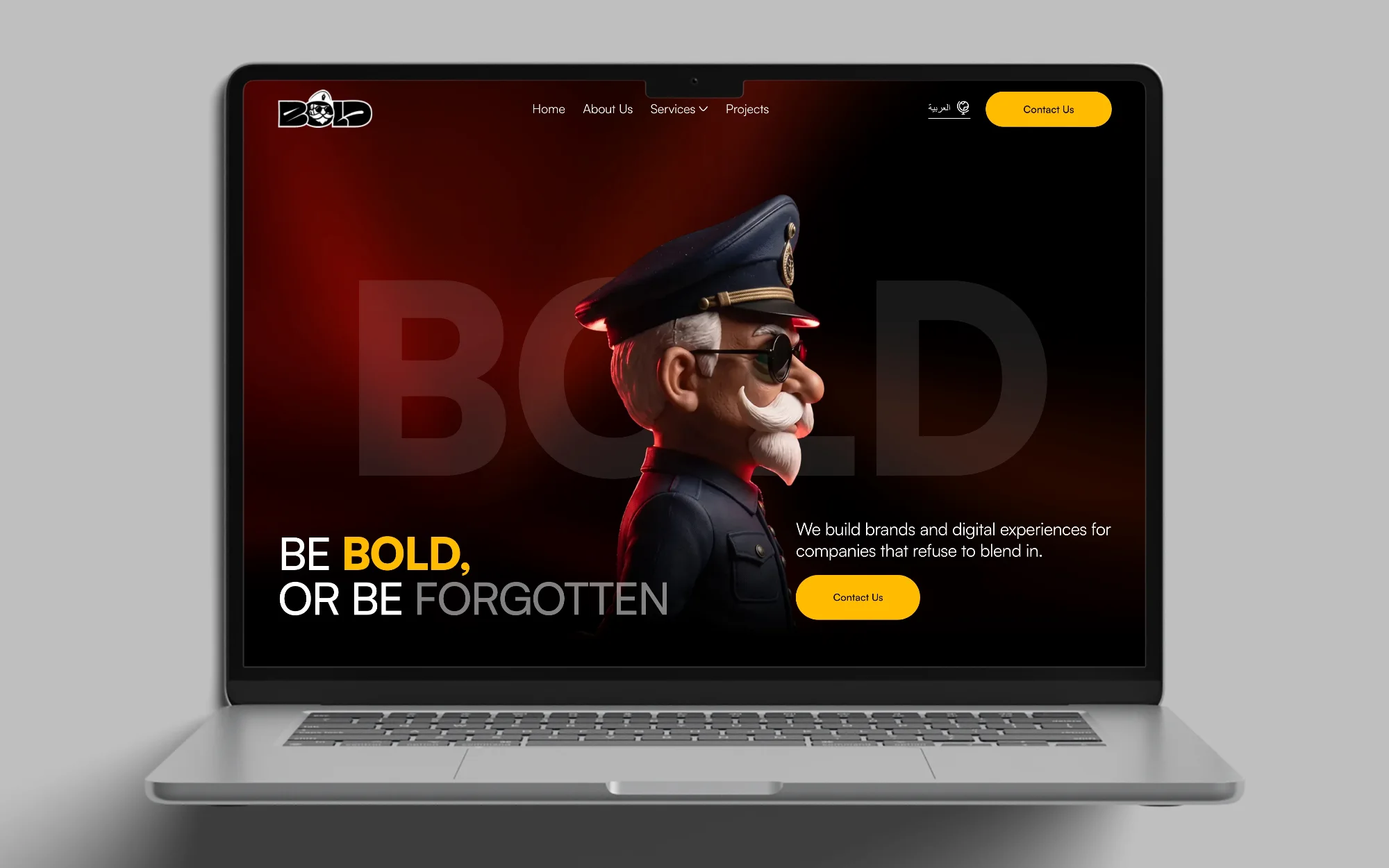
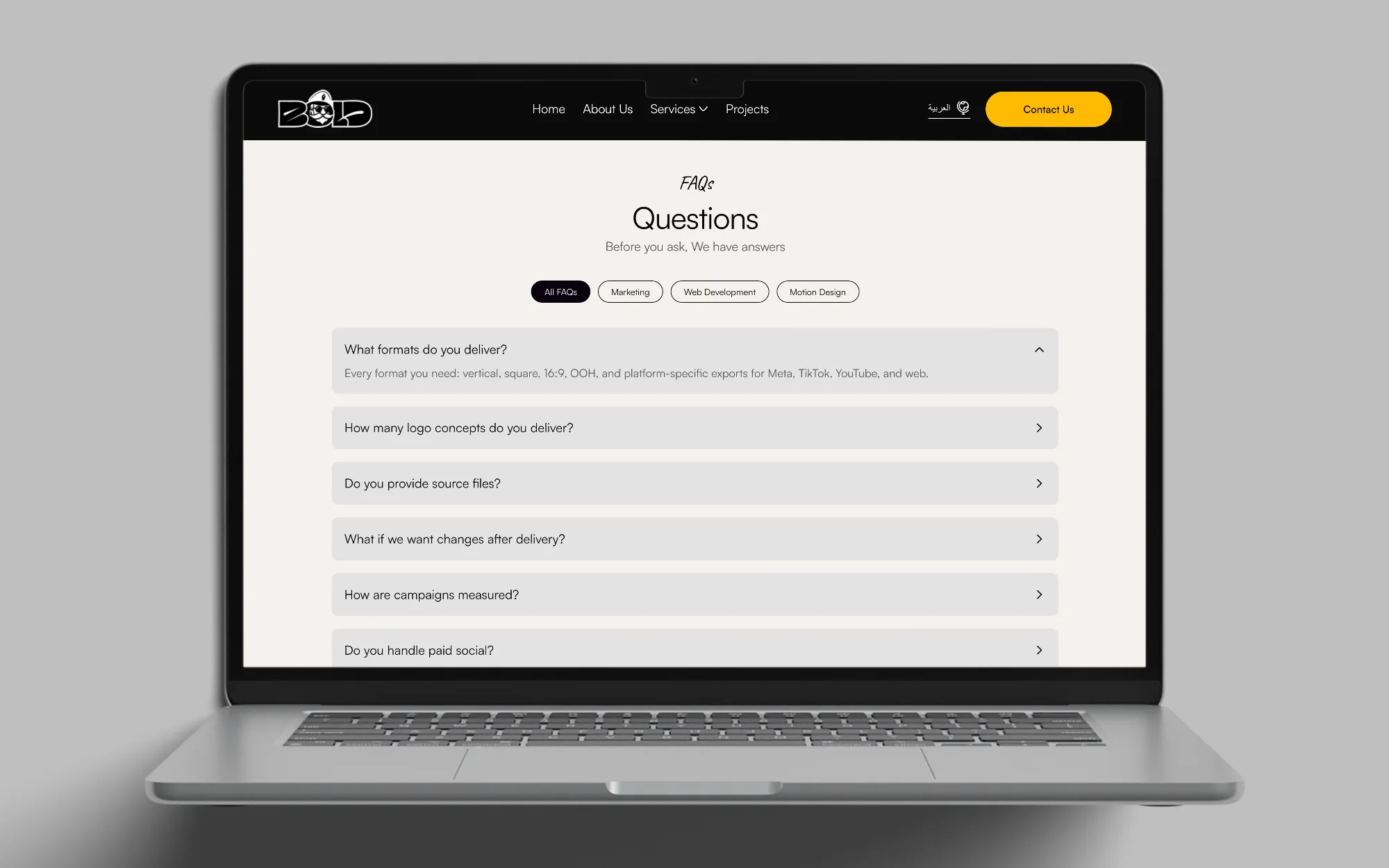
Bold’s identity is loud: a black page, one yellow accent and a cartoon character who is part of the brand. The challenge was to keep that energy without making a long page hard to scan. The home page runs from About Us through services, quick add-ons, selected work, testimonials, FAQs and the blog, so I had to give every section a clear start and end.
Key Decisions
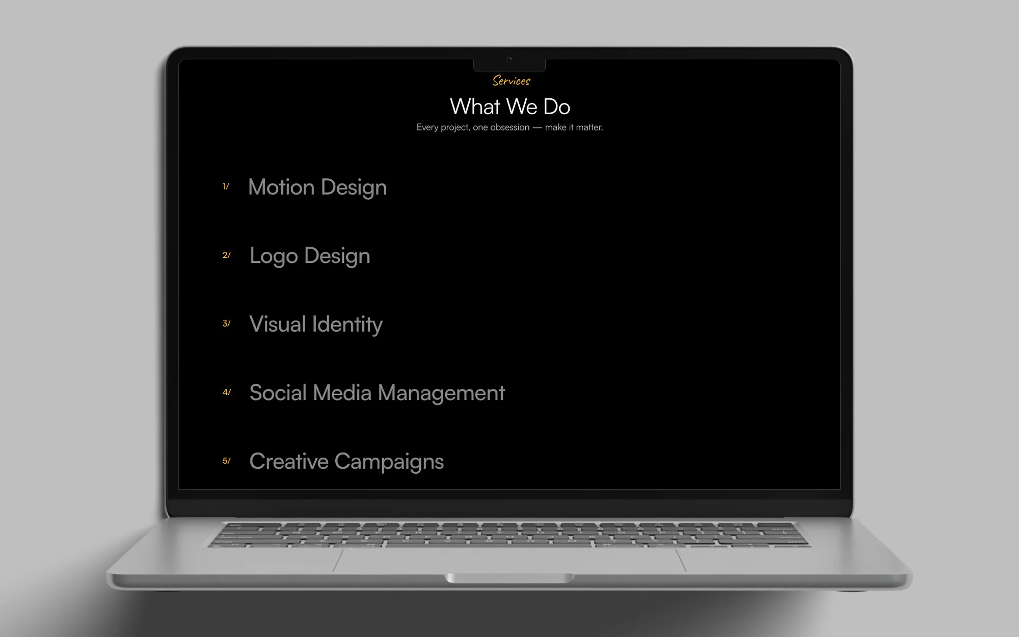
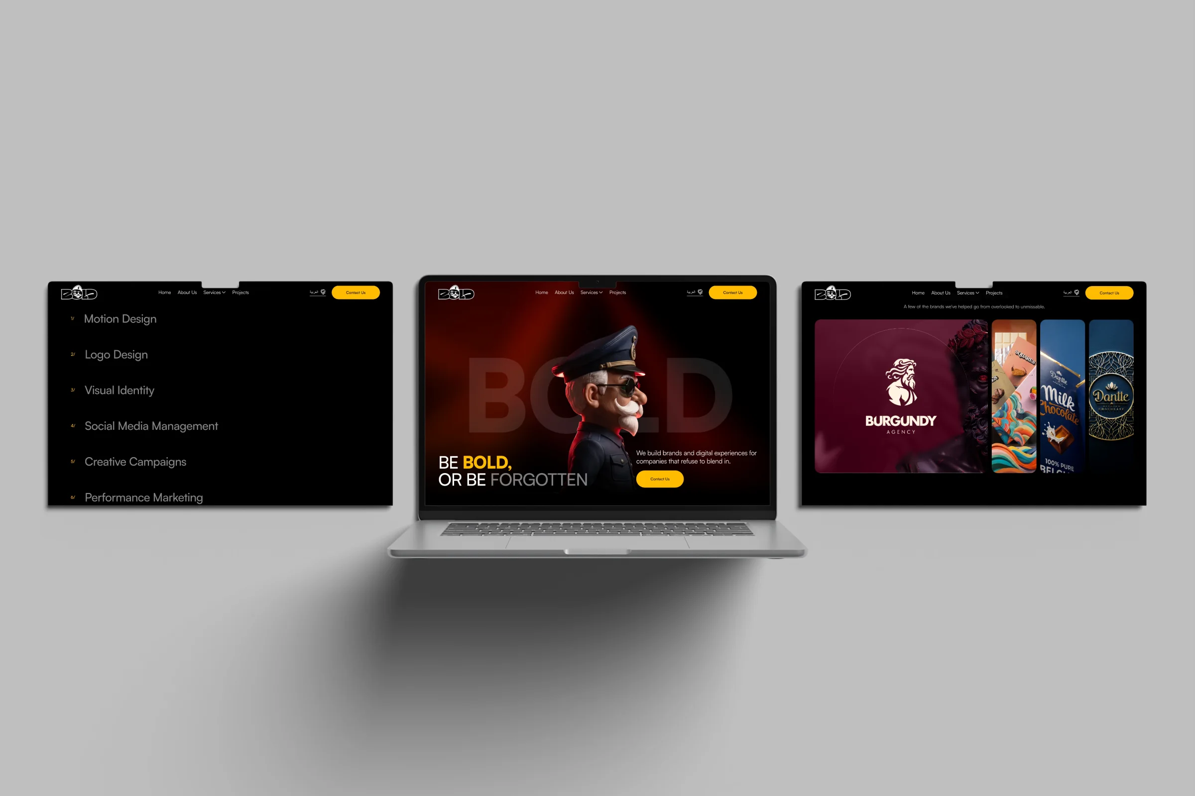
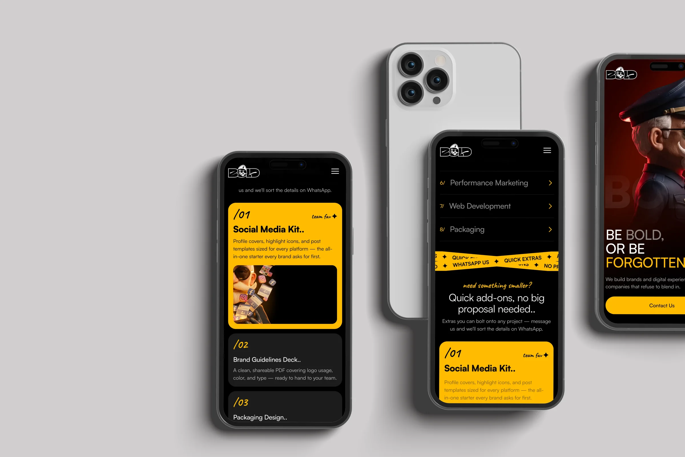
A list you can scan. I set the eight services as large lines under a yellow label, each with a small yellow number from 1/ to 8/. The numbers are the only colour in the list.
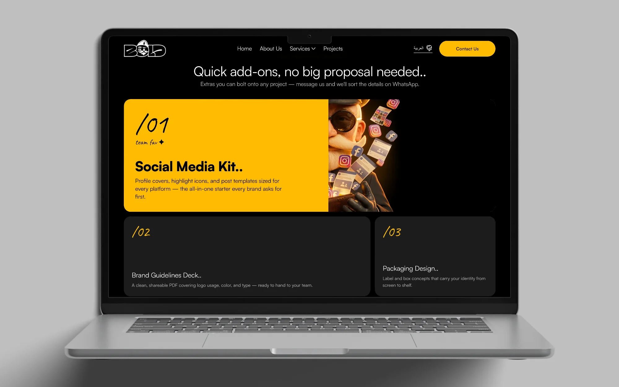
Small jobs get their own strip. I used a yellow band that reads WhatsApp US, Quick Extras, Add-ons and No Proposal Needed to break the page. Below it, Quick add-ons, no big proposal needed introduces six smaller products, with the Social Media Kit as the yellow card marked team fav. A yellow Like Something? card sends visitors to WhatsApp.
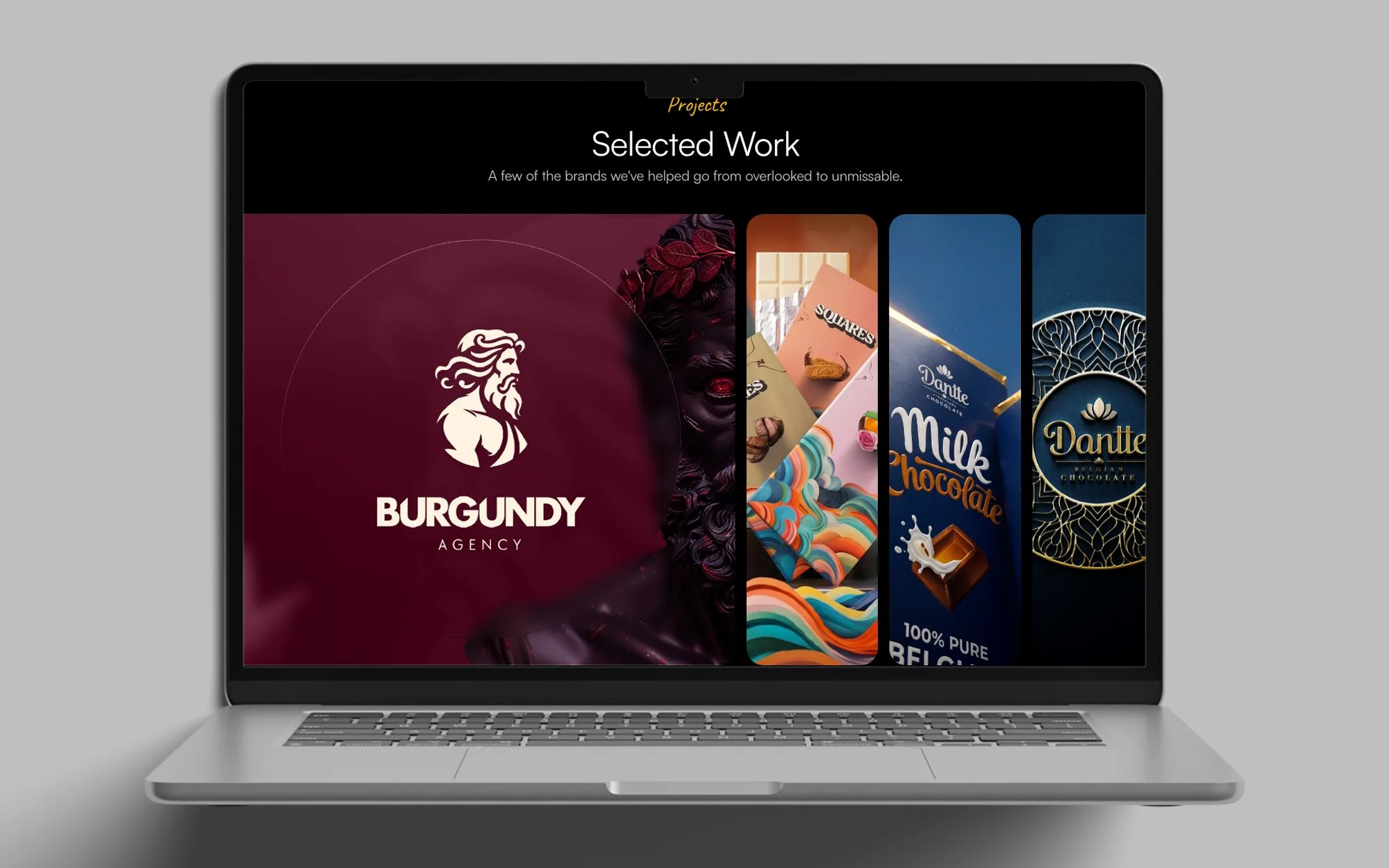
Work as tall cards. I opened Selected Work with one large Burgundy Agency card beside narrow project cards, and put the project name and two arrow buttons under the first card.
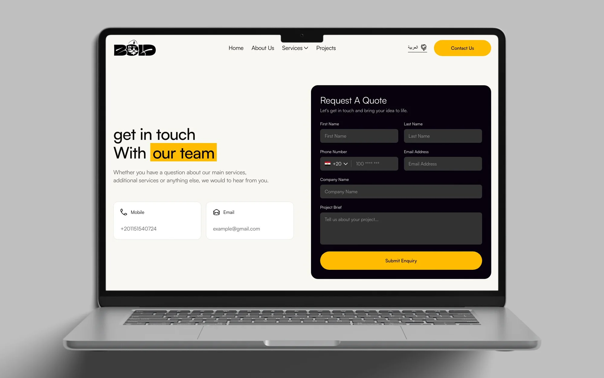
One form for the brief. I paired the heading Get in touch with our team with a Request A Quote form. The form asks for name, phone, email, company and a Project Brief, and ends in a yellow Submit Enquiry button. The mobile and email cards sit under the heading.
The Screens
Client feedback
The client praised the UI.